Waterstone’s Bookshops
Client: HMV Group plc
"Repositioning an existing well-loved high street book retailing brand"
Project Details
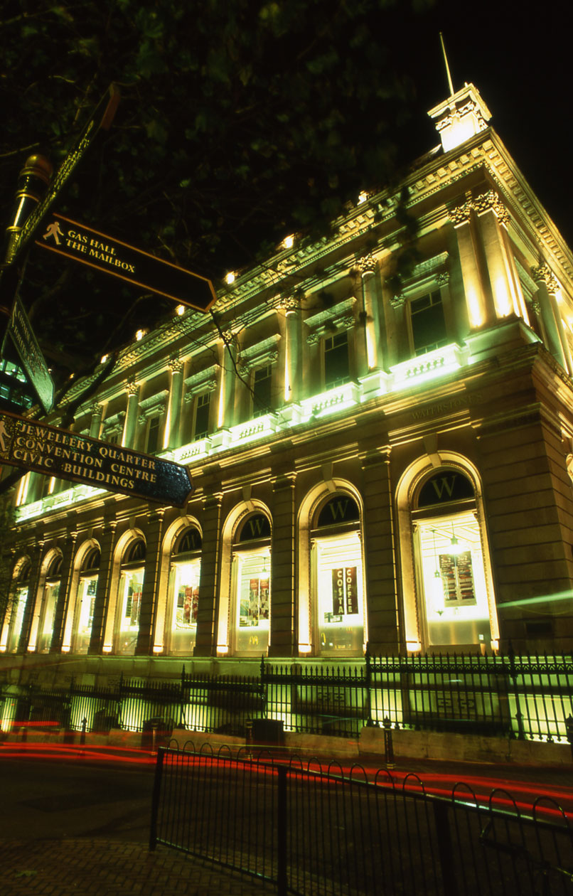
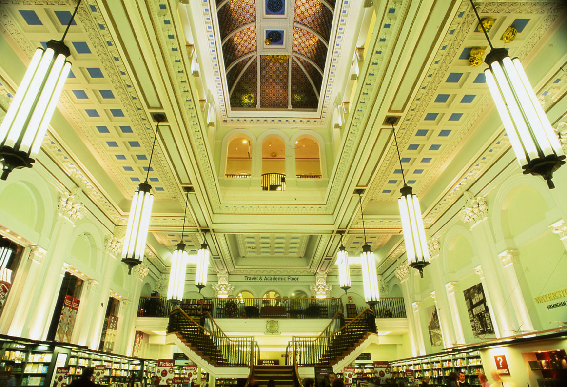
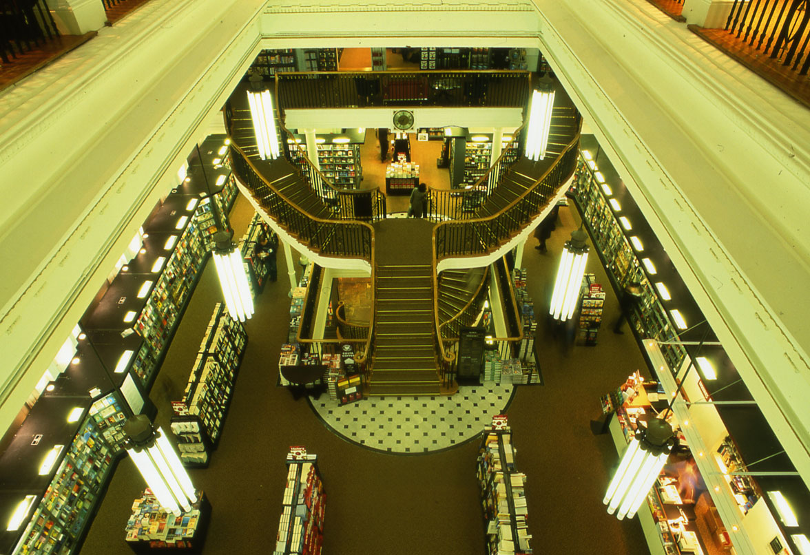
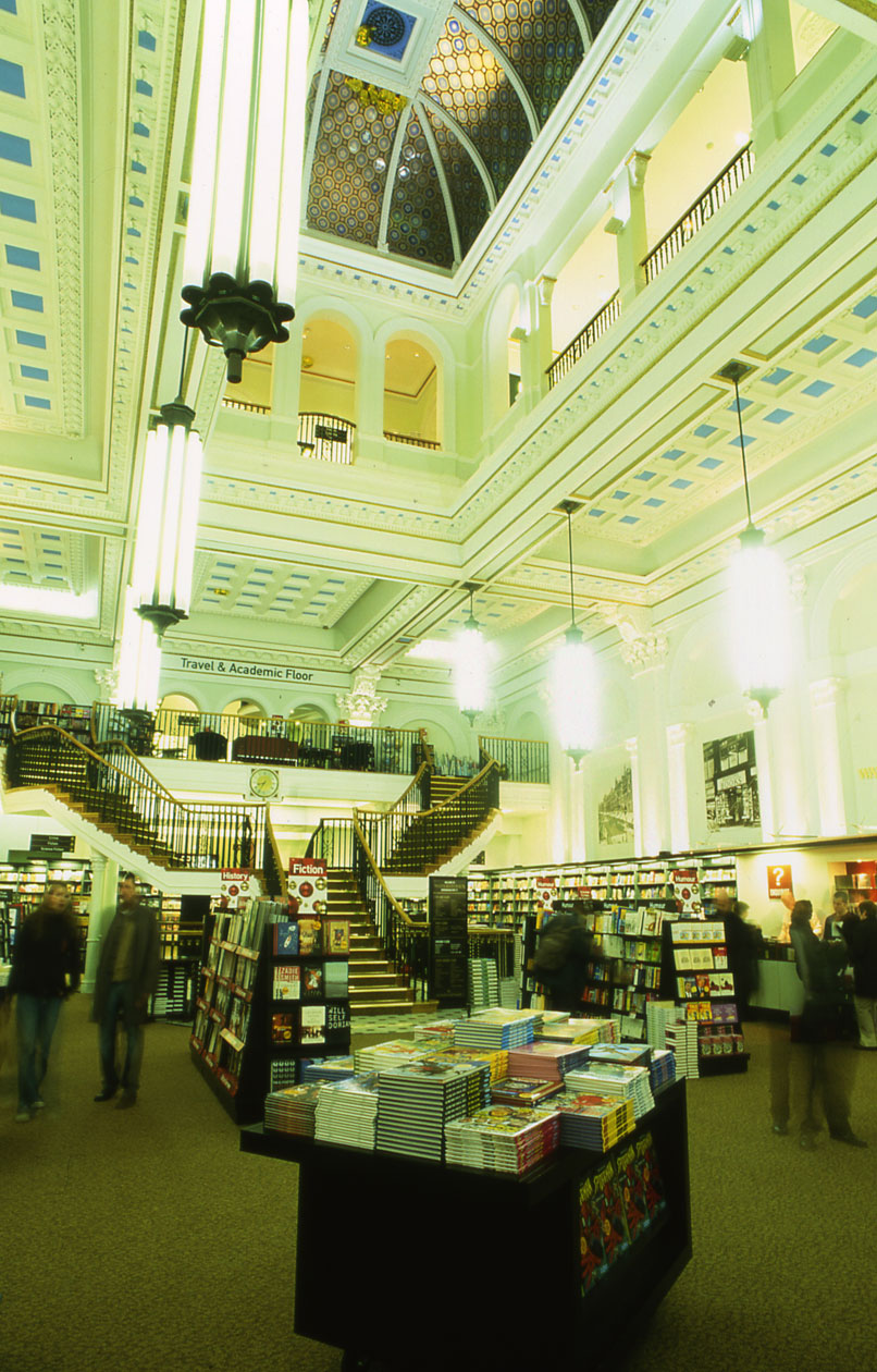
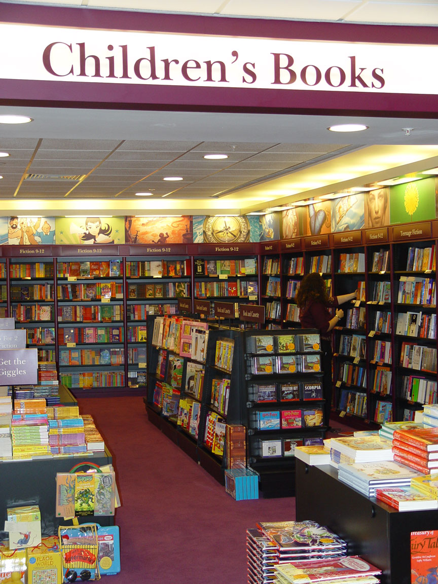
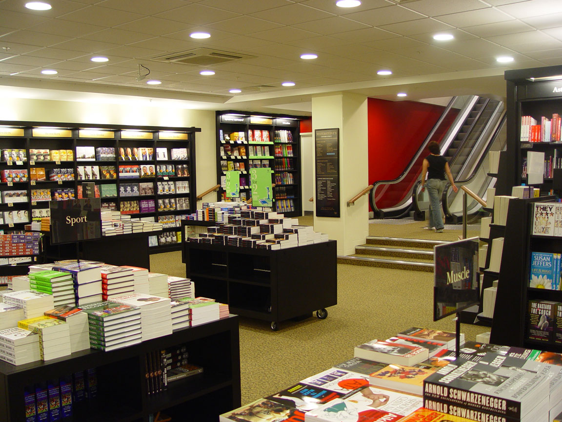
As our first work for Waterstone's Grieg & Stephenson was invited to devise a distinctive store-within-a-store especially planned and designed for children - the only department to be differentiated from the store as a whole. This work grew into a series of over 50 complete store designs, which included their landmark store in a listed old bank building on Birmingham New Street.
- Location50 UK Stores
- ValueUp to 2.8 million
- Time Scale2002 - 2004
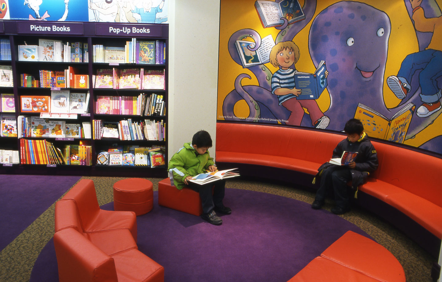
GSA undertook a study of children’s furniture and book display systems which led to the design of subtly lowered display units at 2/3 scale and special units for non-book merchandise. Other key elements in differentiating this special space for the younger reader included the colour scheme and the graphics. The different styles of
well-known children’s books and their illustrations were the inspiration for headers and information signage exclusive to the department. The concept we devised was trialled at Stratford-upon-Avon and later developed for implementation across the chain.
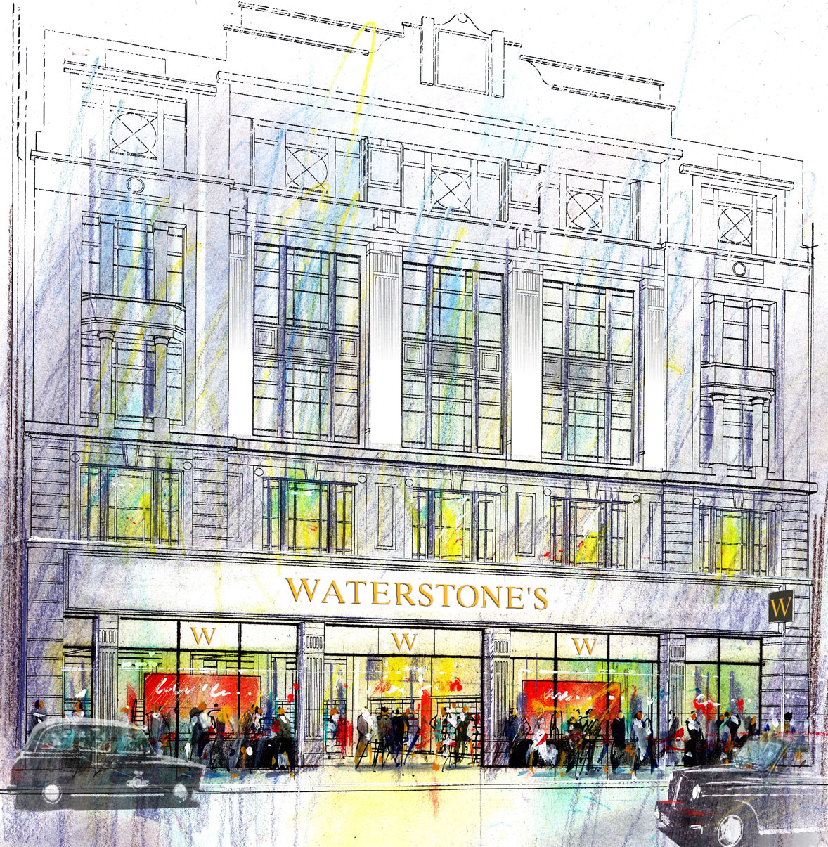
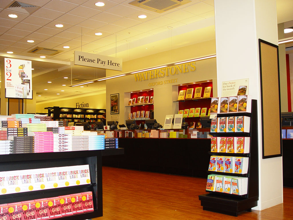
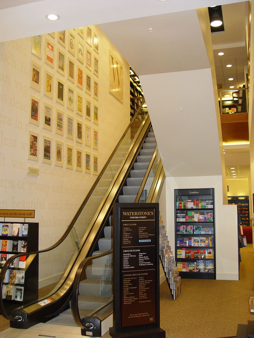
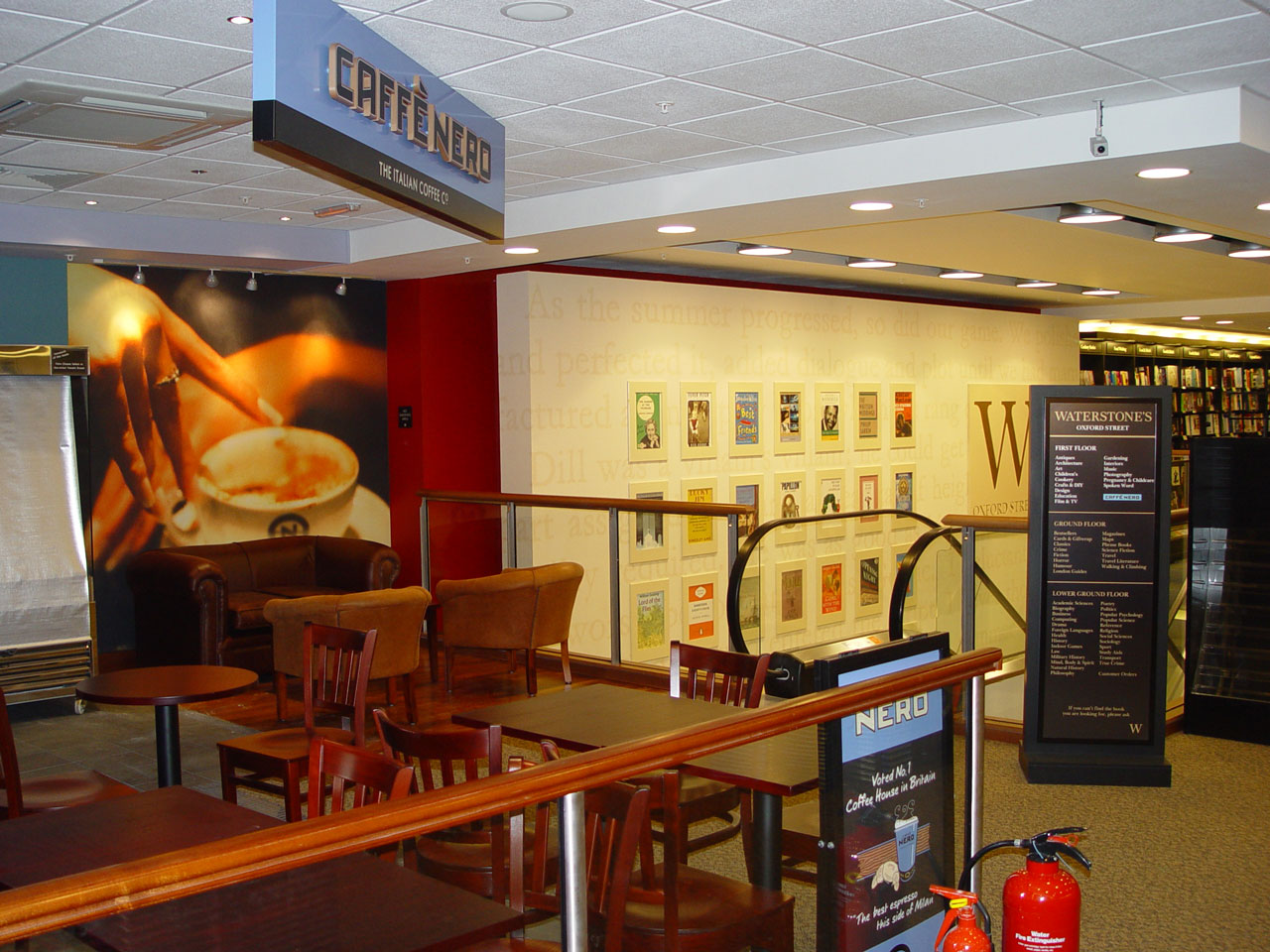
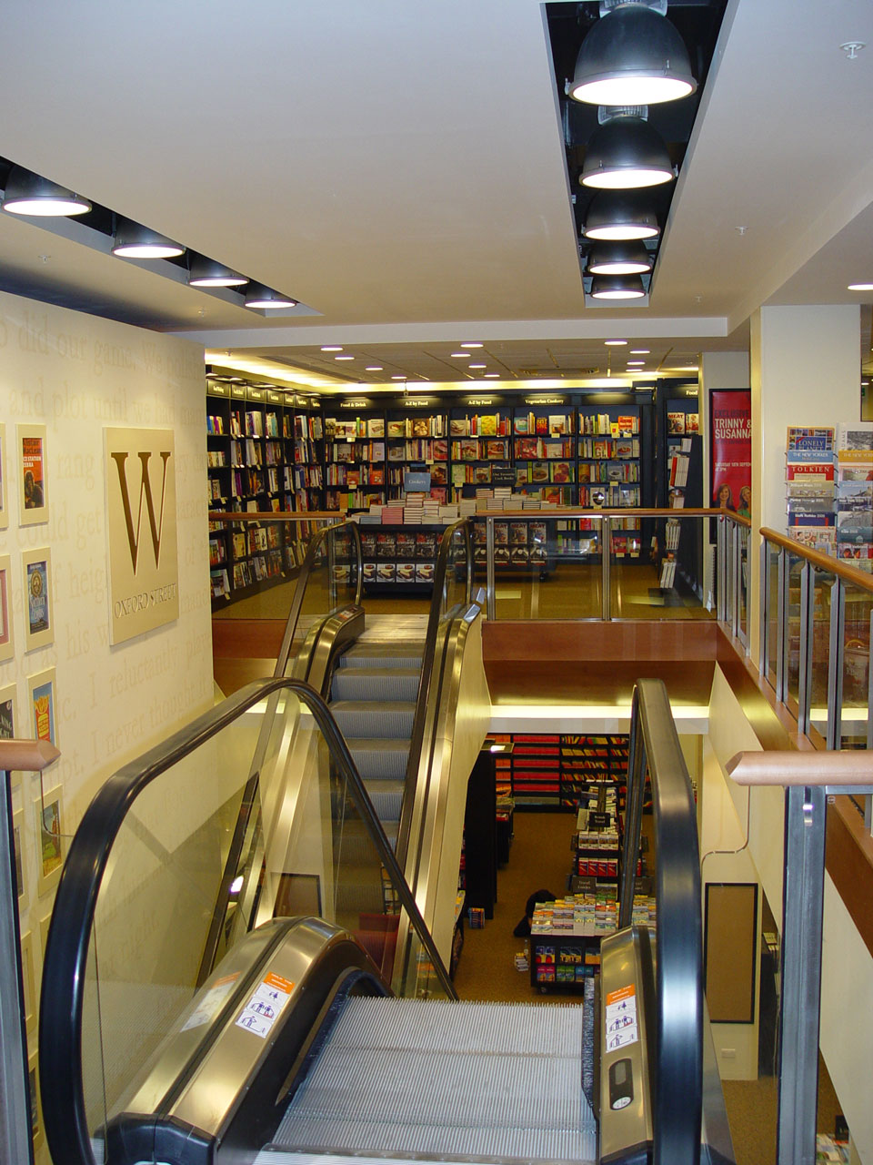
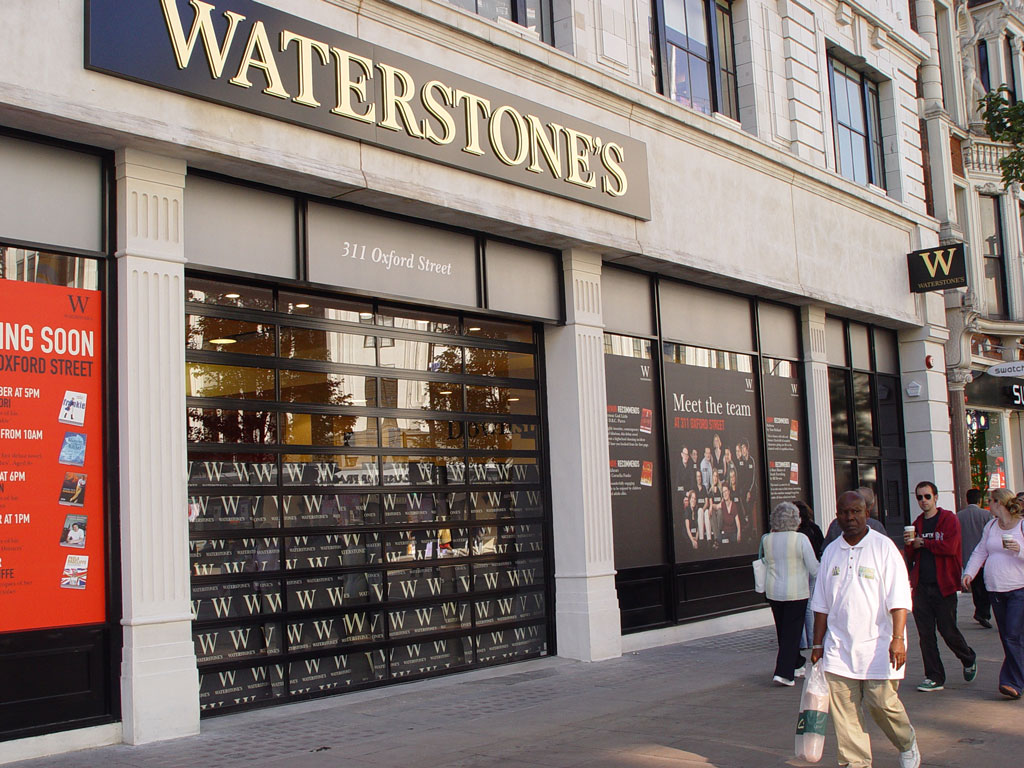
This work grew into a series of over 50 complete store designs, which included their landmark store in a listed old bank building on Birmingham New Street and in London their new store at 150 Oxford Street and work to their existing flagship store in the listed former Simpson’s of Piccadilly building.
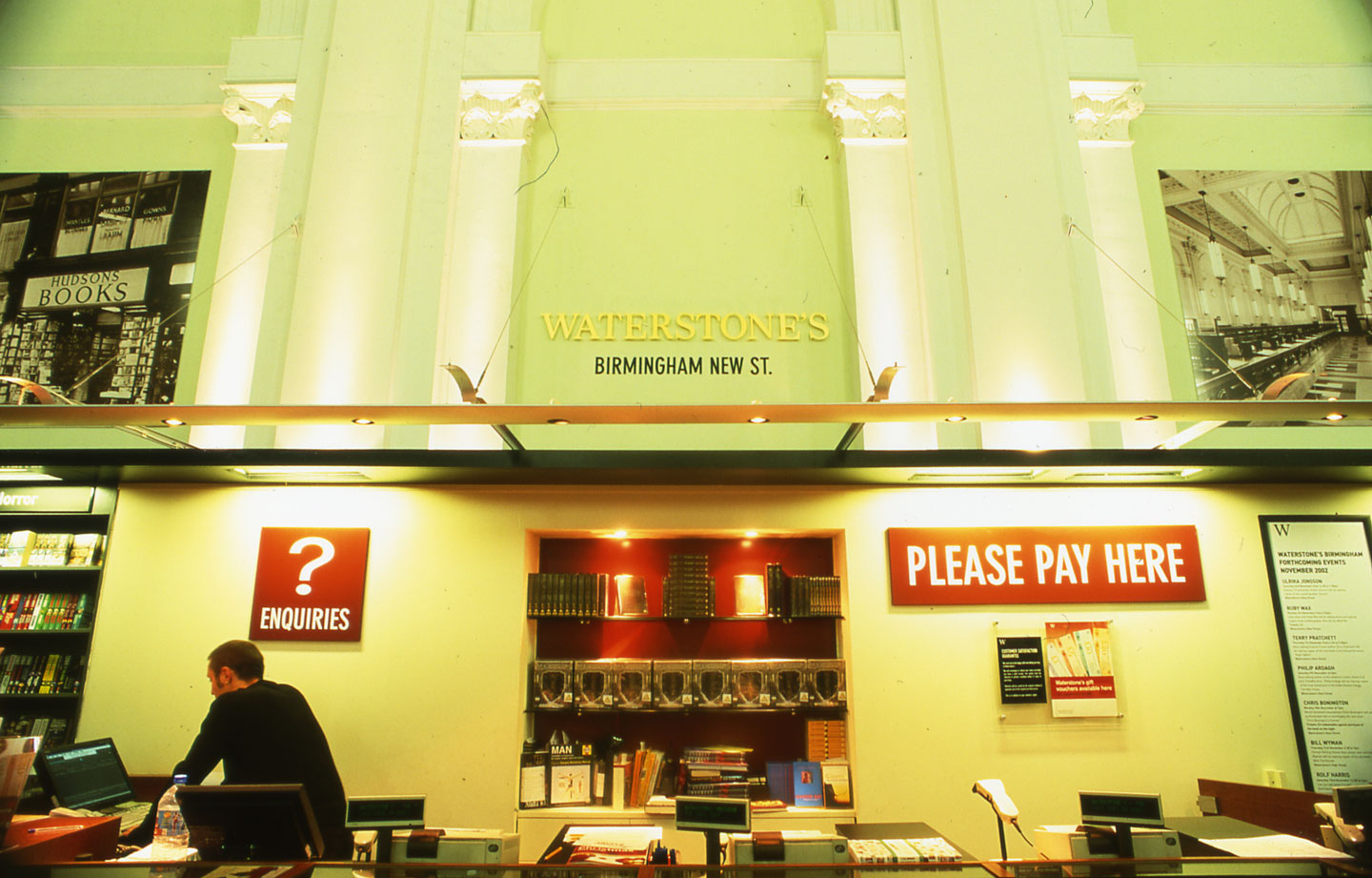
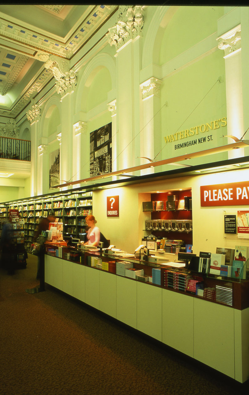
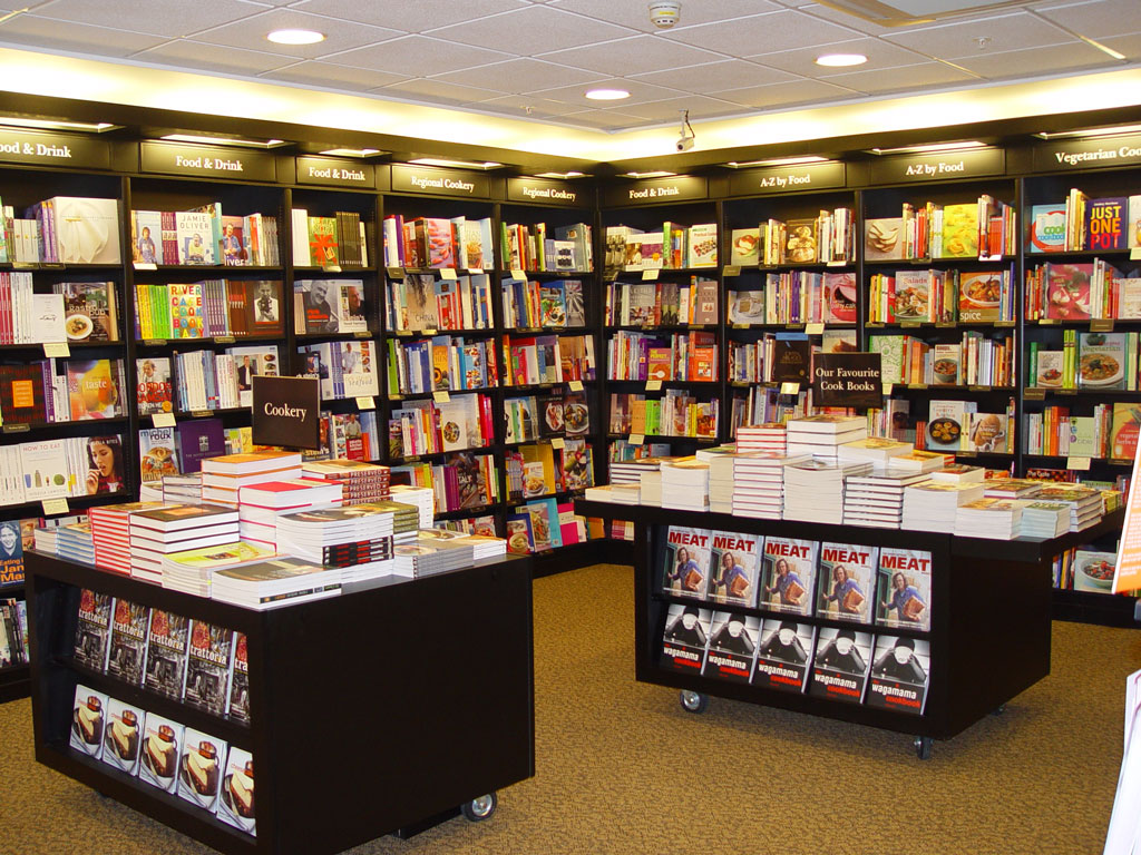
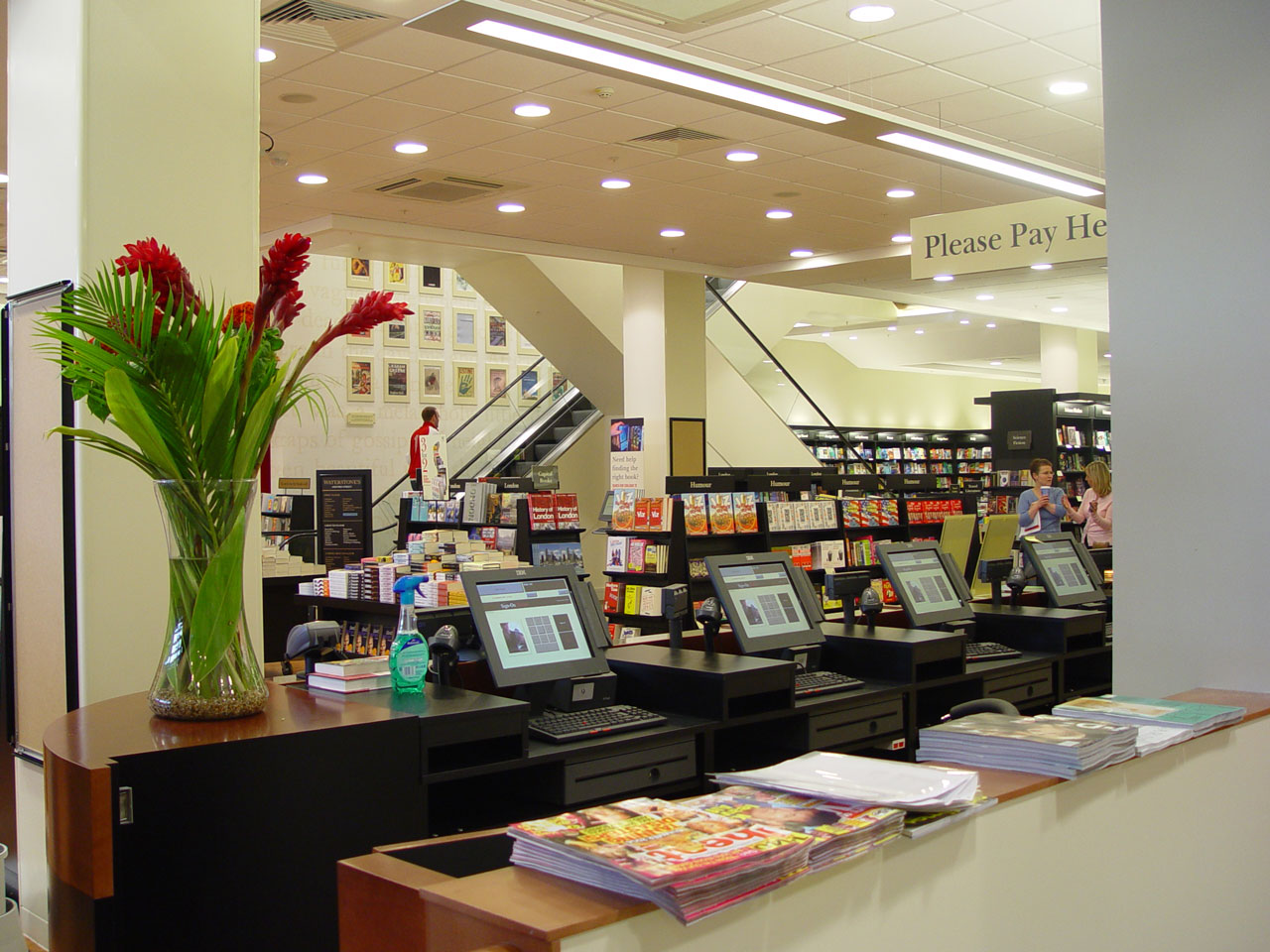
GSA work with Waterstone’s moved on to encompass an appraisal of the graphic communications for stores within the group. With the aim of reinforcing Waterstone’s perceived position as the market leader in books, we undertook an analysis of the existing signage and created a desirable graphic hierarchy. Working with the authoritative Waterstone’s brand, we used a subtle evolutionary process to create a signage system that was both clearer and more consistent. All the signage from ‘Please Pay here’ to the departmental directories has been unified to a Waterstone’s style.


